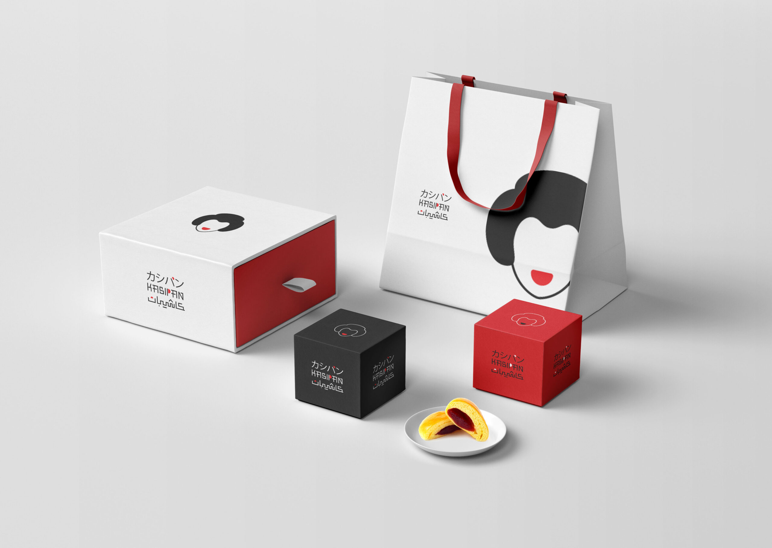
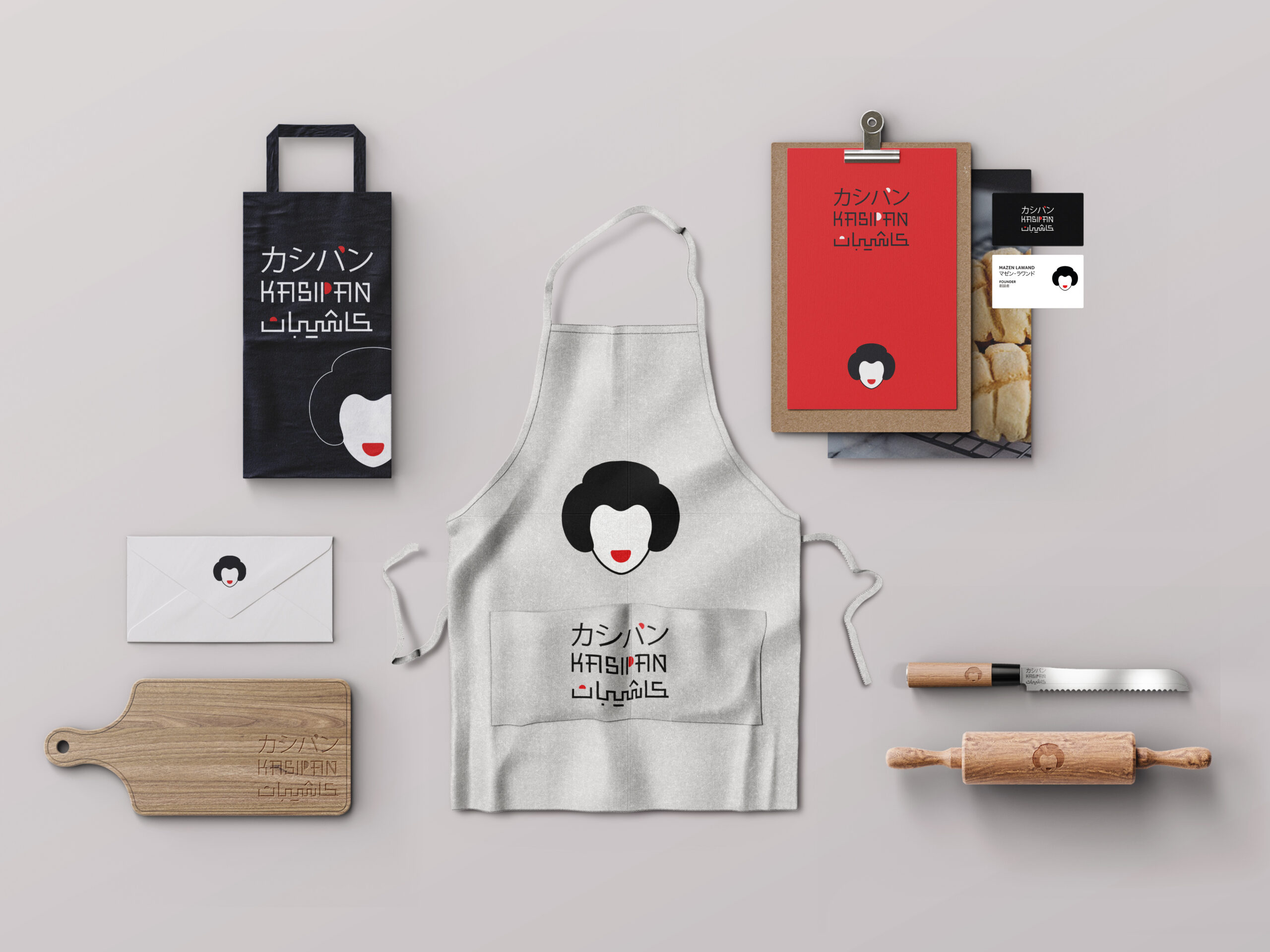
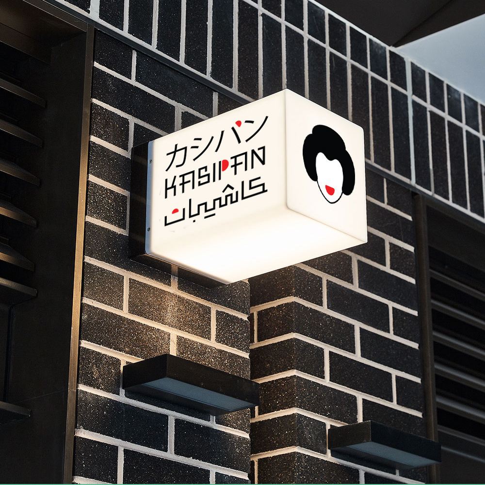
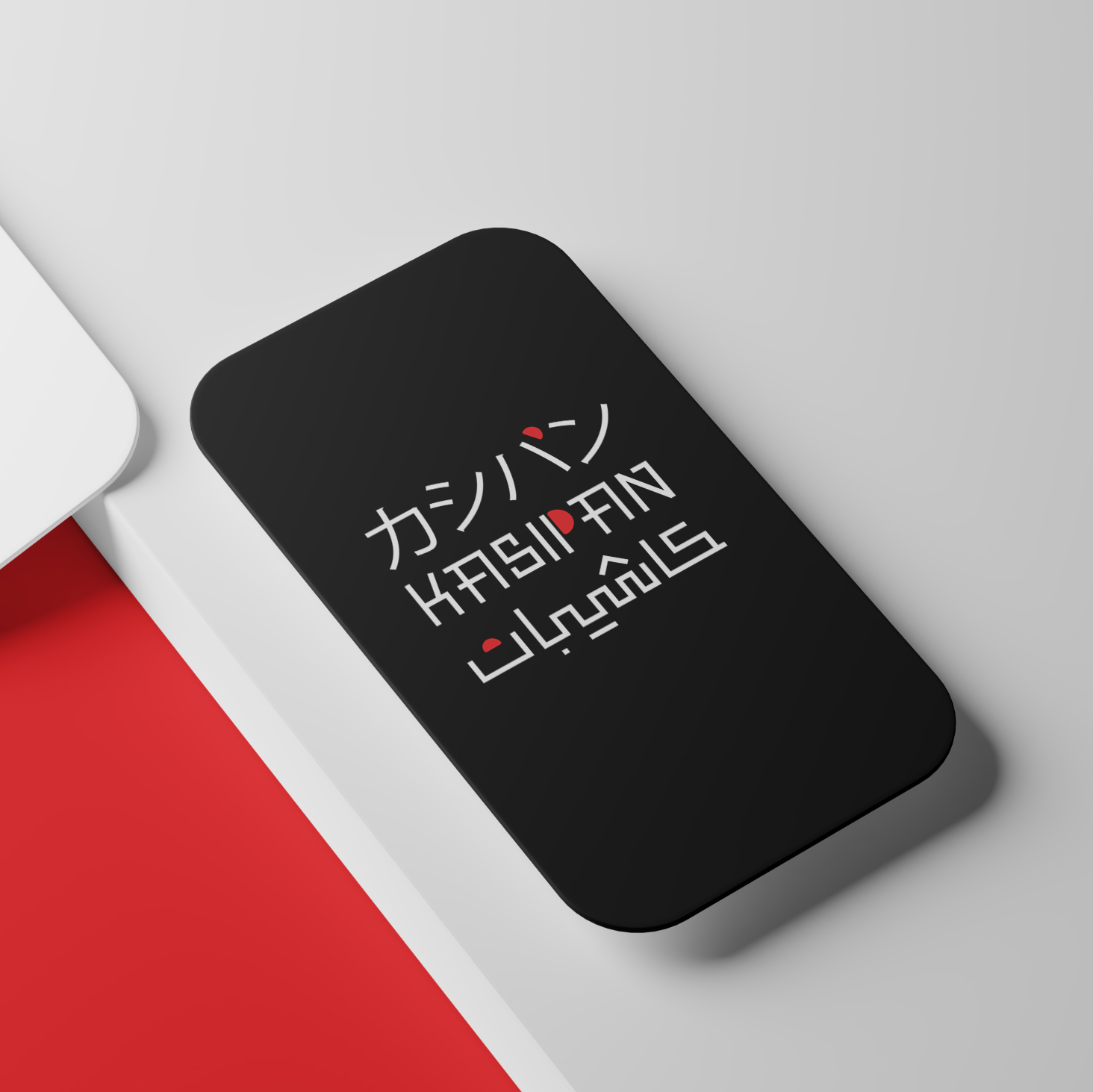
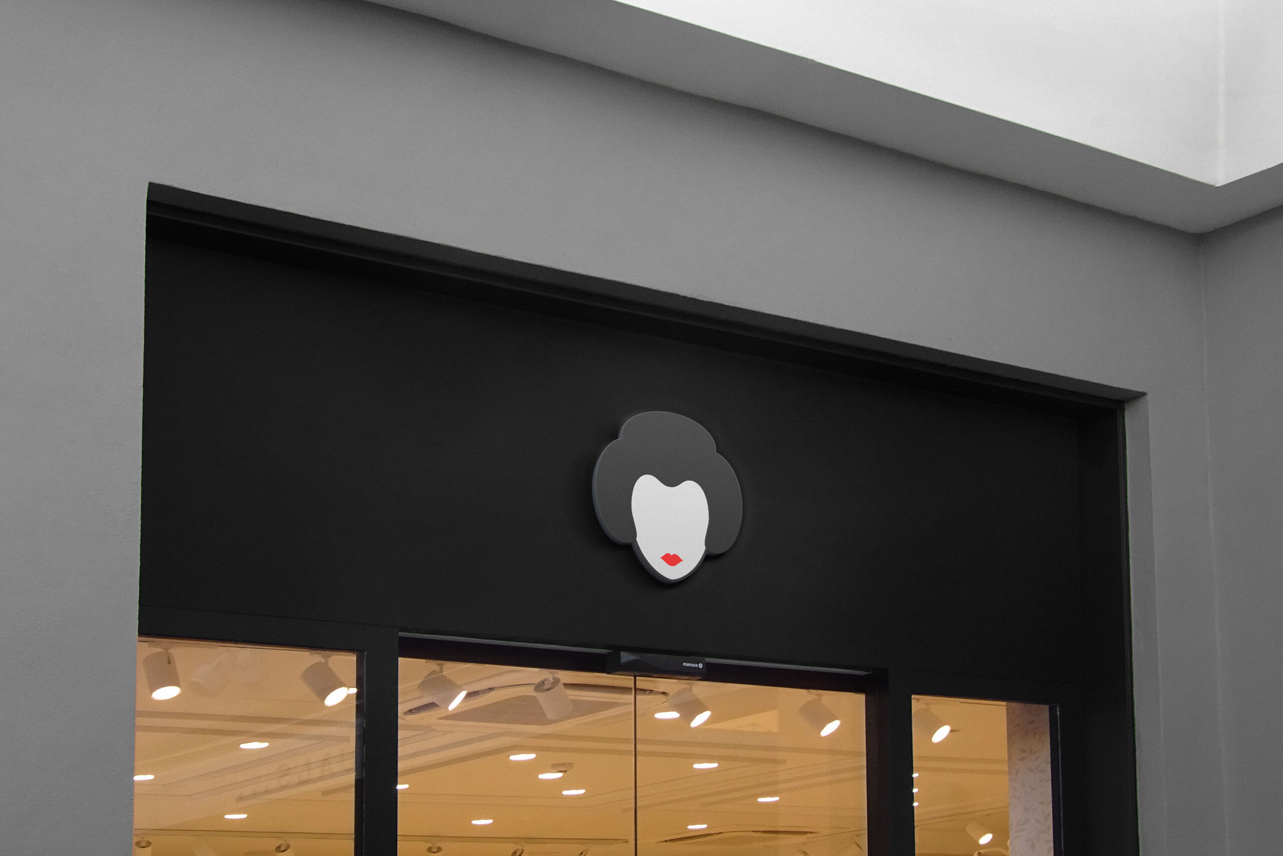
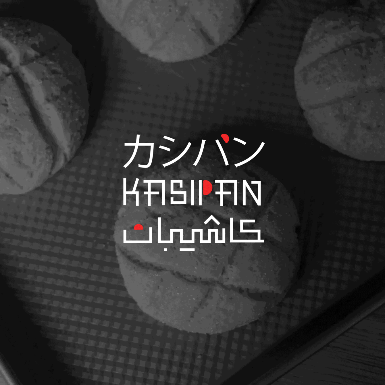
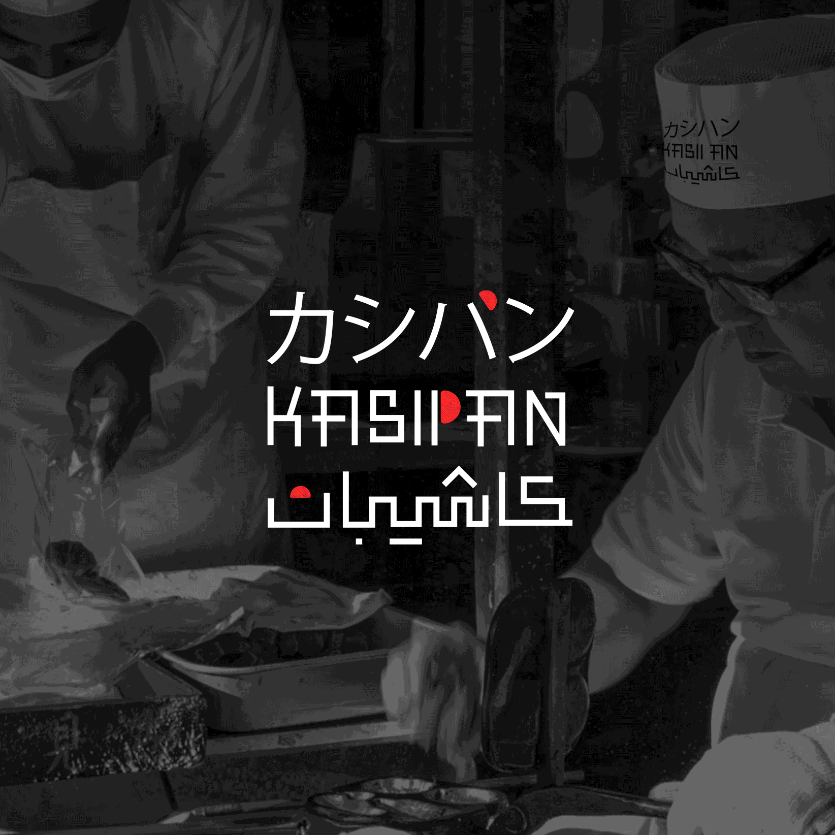
Kashipan is a Japanese-inspired bakery in Riyadh, Saudi Arabia, specializing in modern interpretations of traditional sweet breads. Drawing from the Japanese words “kashi” (sweet) and “pan” (bread), the brand reinvents classic anpan as cake-like treats with innovative fillings and toppings. The branding project aimed to create a cohesive identity that captures the essence of Japanese culture while appealing to a diverse, multilingual audience in Saudi Arabia.
Challenge
The primary challenge was to create a brand identity that seamlessly blends cultural authenticity with contemporary design. Balancing Japanese heritage with a modern appeal required integrating traditional elements, such as the kimono style, while maintaining relevance to a global audience. Additionally, the trilingual logotype had to ensure clarity and visual harmony across Arabic, English, and Japanese languages.
Solution
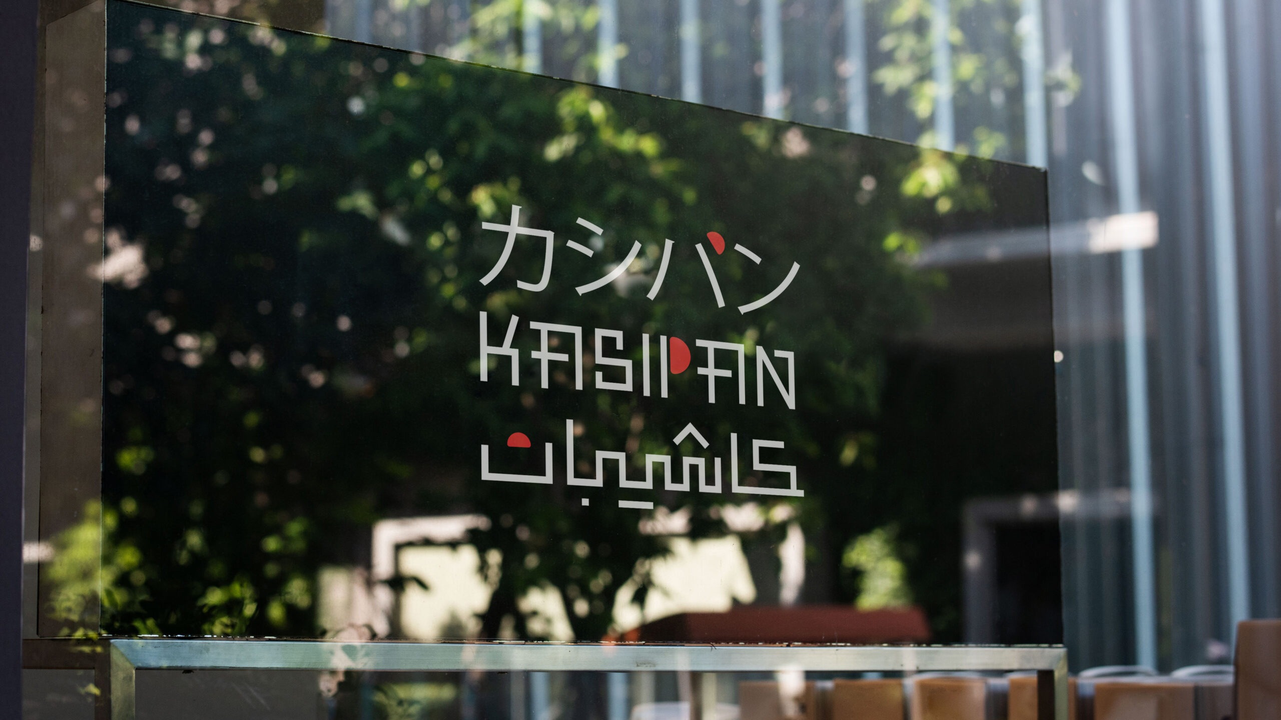
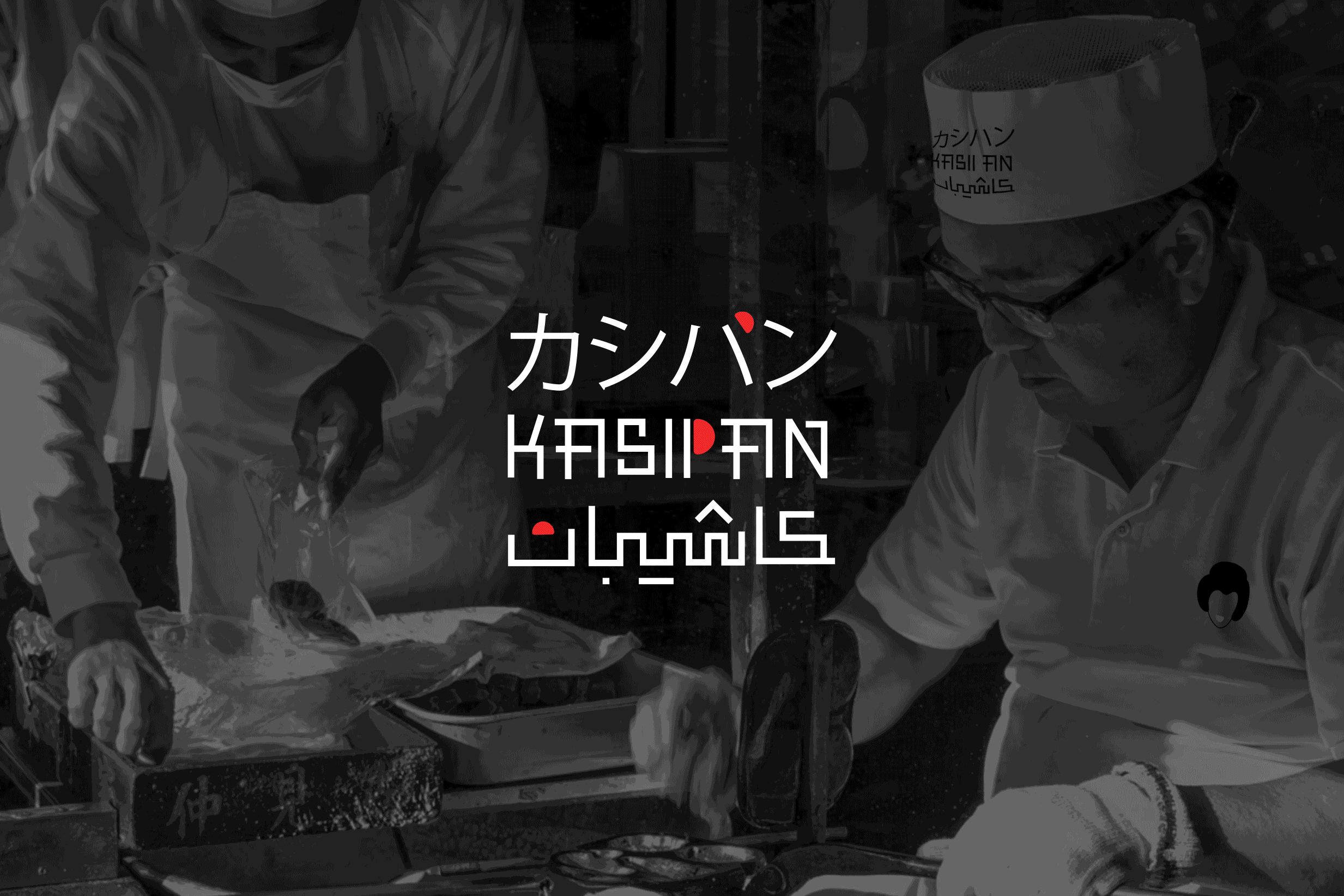
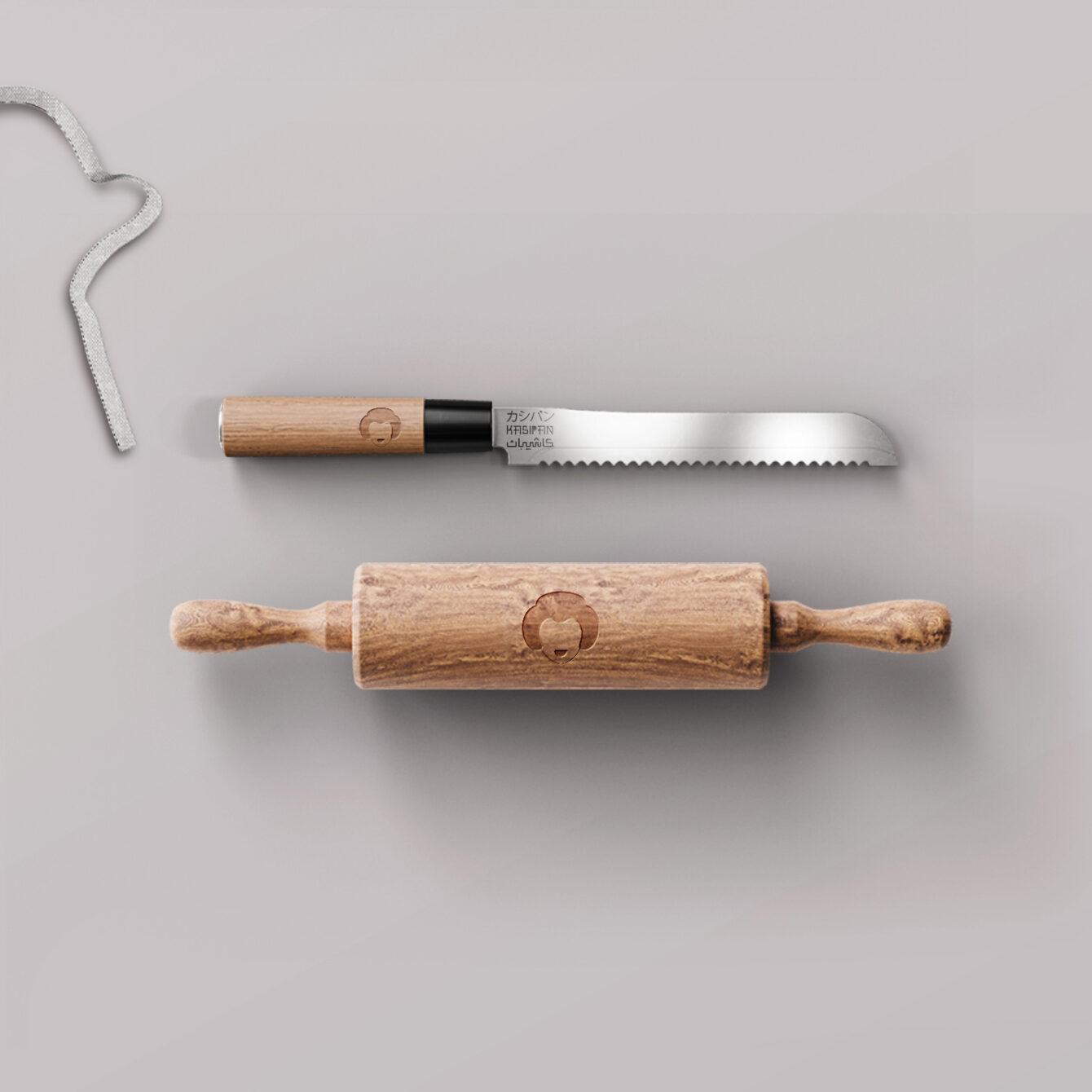
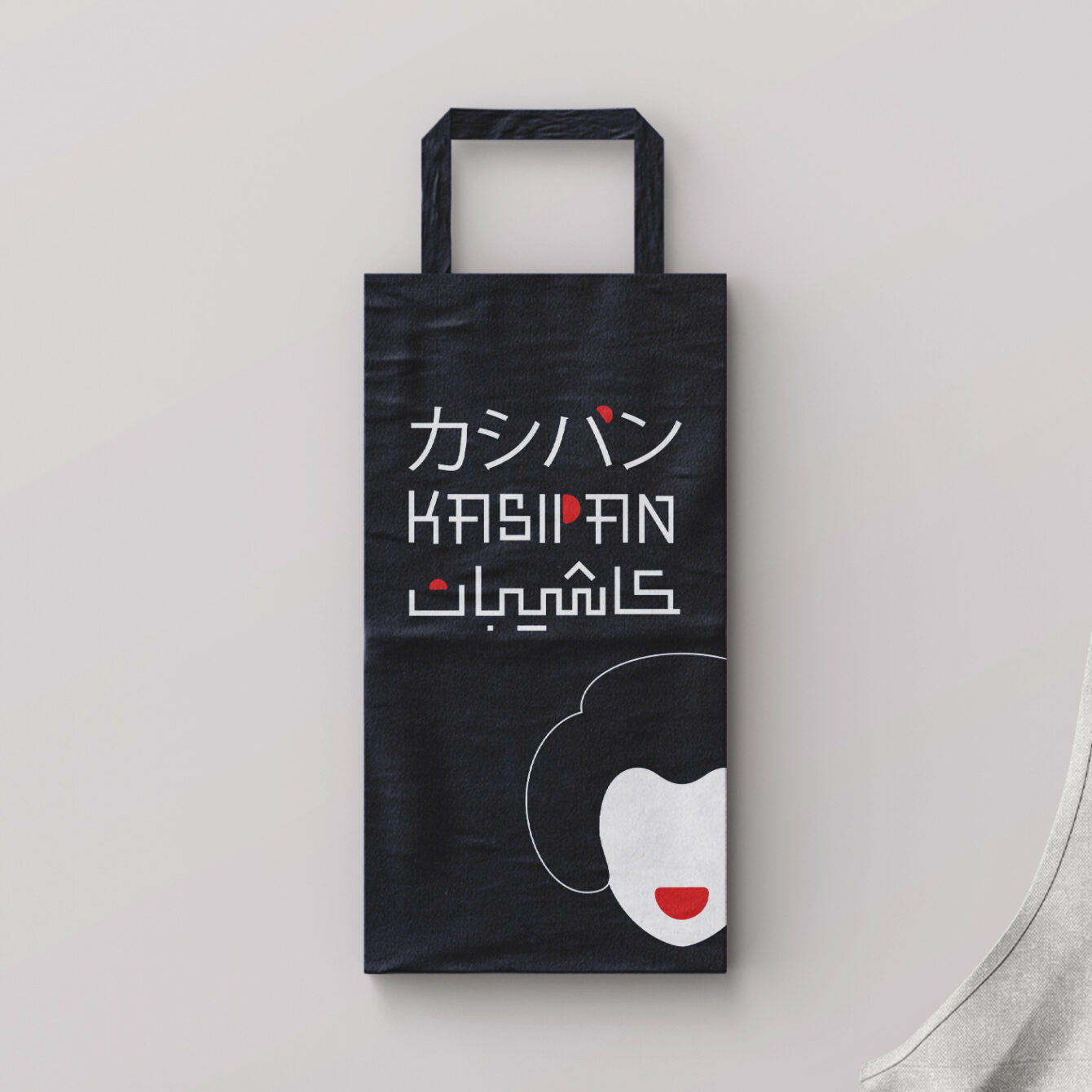
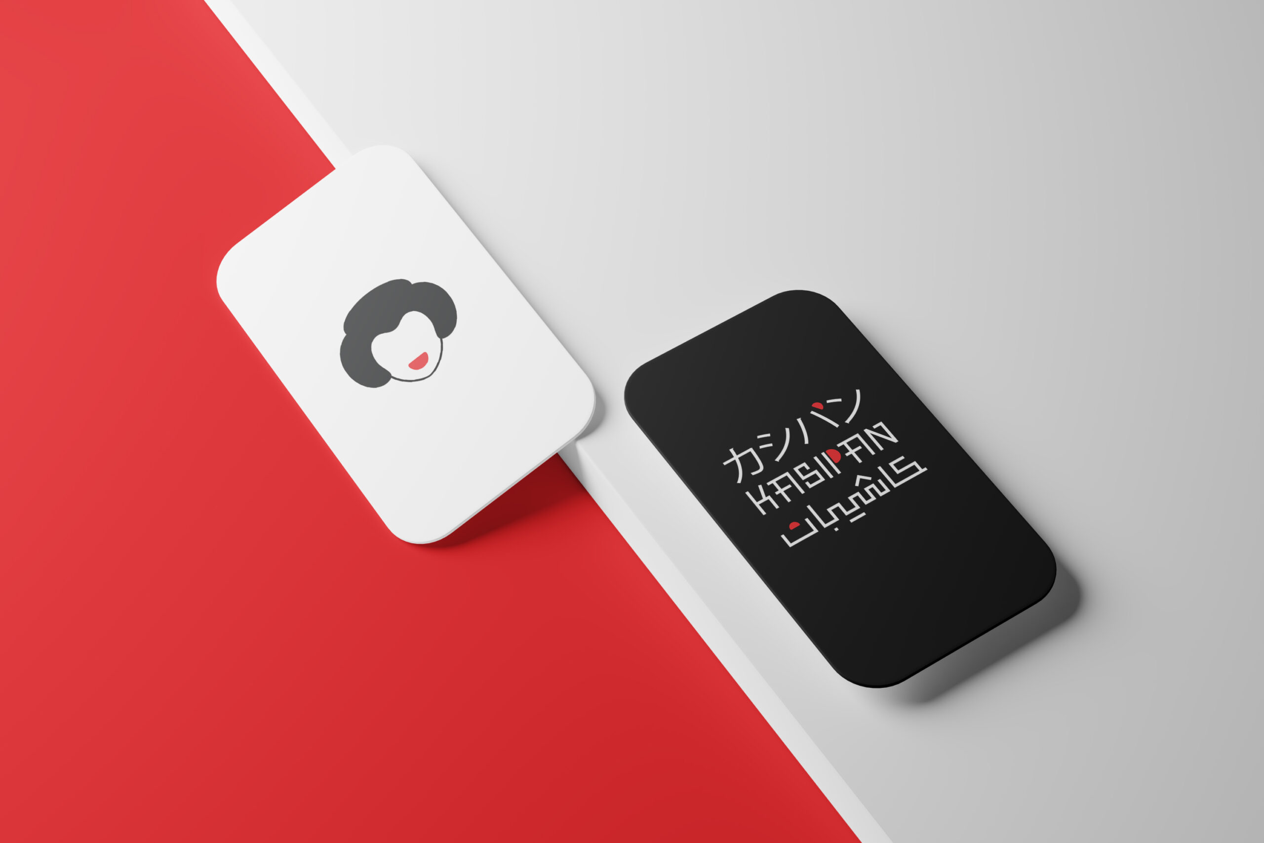
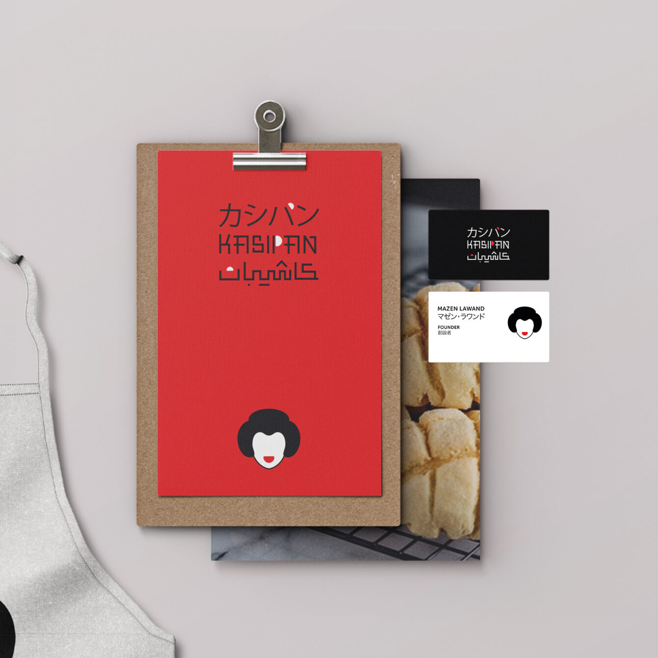
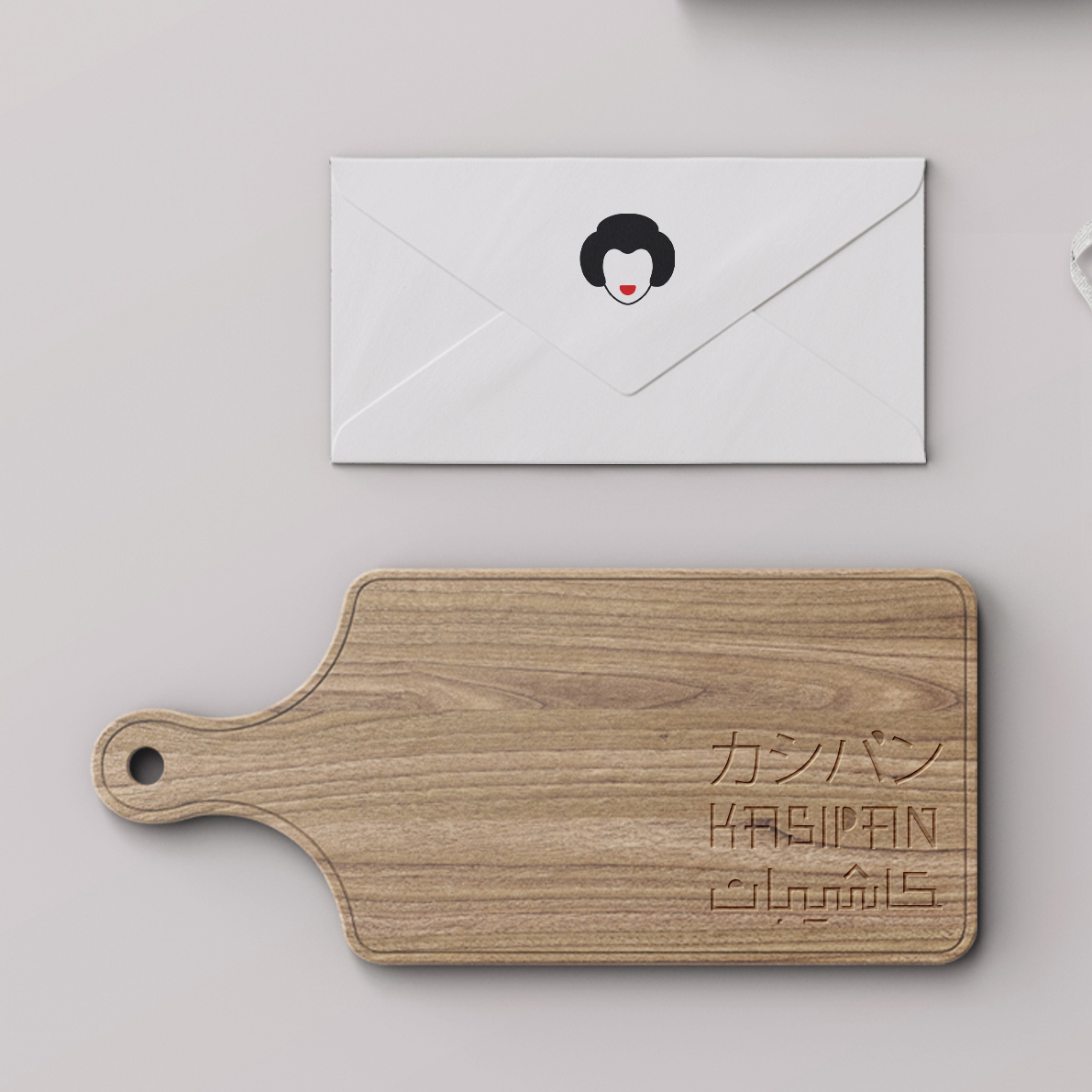
The design solution incorporated a fluffy cake shape as a central motif, symbolizing the bakery’s unique offerings. Traditional kimono patterns inspired the visual aesthetics, enhancing the cultural connection. A trilingual logotype in Arabic, English, and Japanese was developed using typography reminiscent of Japanese characters. The color palette of white, red, and black emphasized Japanese heritage while ensuring visual contrast and modernity.
Conclusion
The Kashipan branding successfully captures the fusion of tradition and innovation, celebrating Japanese culture while resonating with an international audience. The cohesive design elements—from the fluffy cake motif to the trilingual logotype—establish a strong, culturally rooted identity. Positioned as a distinctive bakery in Riyadh, Kashipan’s branding reflects both its heritage and its forward-looking creativity.